
Black paint has a reputation problem. Pick the wrong one and you don’t get black you get “black that turns navy at 4pm,” or “black with a weird green cast under your kitchen lights.” Anyone who’s stood in a paint aisle holding four nearly identical swatches knows the feeling. This isn’t really a color decision, honestly. It’s an undertone decision, and most people don’t realize that until they’ve already painted a wall.
Tricorn Black delivers a true black that stays exactly what it promises under every lighting condition. That consistency is rare. That is exactly why designers keep coming back to it.
Undertones Are the Whole Story
Very few paints marketed as “black” are actually neutral black. Most carry a hidden lean toward brown, blue, green, or purple that only shows up once the paint’s dry and the light’s hitting it at a different angle than it did in the store. That’s why two “black” cabinets from two different brands can look nothing alike sitting next to each other, even though both cans said black on the label.
A handful of paints in this space are prized specifically because they avoid that problem. Farrow & Ball’s Off-Black, for instance, reads as a genuinely soft, warm black rather than a stark one popular for older homes where a harsher black would clash with existing woodwork. PPG’s Black Magic leans a touch warmer too, closer to a deep espresso than true black once it’s on a large wall. On the cooler end, plenty of “greige-adjacent” blacks pull just enough blue or green to read as charcoal in certain light. Fine if that’s the look you want. Disappointing if you were expecting something more absolute.
Genuinely neutral, no-undertone black is what you’re after? Worth doing real homework before you buy a gallon. A few specific Sherwin-Williams and Benjamin Moore shades get singled out repeatedly by designers precisely because they hold their color consistently across rooms and lighting conditions, and this deep dive into Tricorn Black breaks down why that particular shade has become something of a default recommendation for exactly this reason.
What Light Reflectance Value Actually Tells You
Every paint color has a Light Reflectance Value, LRV for short a number between 0 and 100 measuring how much light the color bounces back versus absorbs. Zero’s theoretical pure black. 100’s pure white. In practice, residential black paints tend to land somewhere in the low single digits, and that number tells you more about how a color will actually behave on your walls than the paint chip ever will.
A lower LRV means the color holds its darkness consistently regardless of which direction your windows face. A higher LRV even just a few points higher means the color shifts more noticeably between a north-facing room and a south-facing one, sometimes reading as charcoal in one and near-black in another. Exactly why two paints that look identical on a sample card can behave completely differently once they’re covering an entire wall exposed to real daylight throughout the day. Consistency across your whole home matters to you? Checking the LRV before you buy is a five-minute step that saves you a repaint.
Sheen Matters More Than People Expect
Color choice gets all the attention, but sheen’s where a lot of black paint projects actually go wrong. A true black in high gloss stops looking rich and starts looking almost industrial the depth that makes black appealing in the first place gets flattened out by all that reflected light bouncing off a shiny surface.
Eggshell or matte finishes are generally the safer call for walls, since a lower sheen absorbs light rather than throwing it back at you. Exactly what makes a black room feel moody instead of stark. Satin tends to be the practical ceiling for cabinetry, trim, and doors durable enough to wipe down, without tipping into the glossy, almost plastic look a full gloss finish can create on a large black surface. Flat or chalky finishes work well for furniture pieces going for a more worn, antique character, though it’s worth choosing a scuff-resistant flat formula specifically, since standard flat paint marks easily on anything that gets touched or bumped regularly.
Where Tricorn Black Paint Actually Earns Its Keep
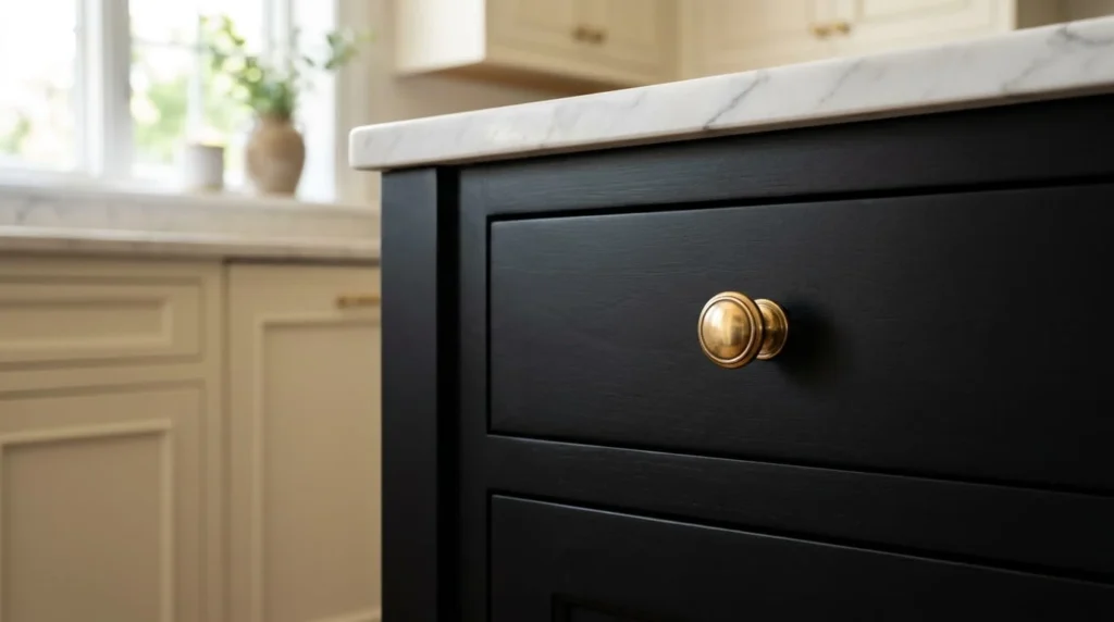
Kitchen islands are probably the single most common entry point for homeowners trying black paint for the first time. Smart place to start, too painting just the island a deep black while keeping the surrounding cabinetry in a lighter neutral creates real visual contrast without committing your whole kitchen to a dramatic look you might second-guess later.
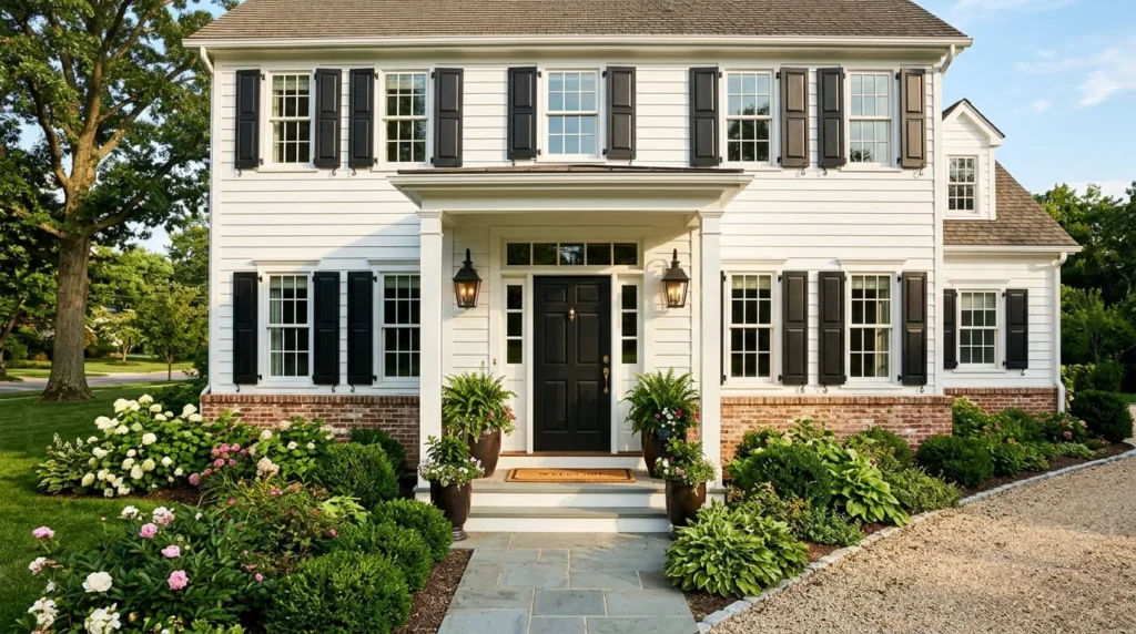
Front doors and shutters are the next most common application, and for good reason: black exterior accents against a lighter siding color deliver a genuinely outsized curb-appeal return for a relatively small, contained painting project. Garage doors painted black tend to visually recede rather than dominate, useful if your garage currently competes for attention with the rest of your home’s facade. Interior applications like closet doors, laundry room cabinetry, and powder room walls are lower-stakes places to test whether you actually like living with black before committing to something larger and harder to reverse. Like an entire exterior, say.
Testing Before You Commit
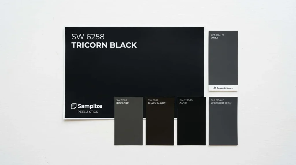
Dark colors are notoriously difficult to judge from a small paper swatch, since a two-inch chip can’t show you how a color shifts across a full wall over the course of a day. Large peel-and-stick paint samples solve this more reliably than a tester pot and a paint stick move a big sample around the actual room, check it in morning light, afternoon light, under your regular evening lighting, and hold it against your existing trim, flooring, and cabinetry before you commit to buying a full gallon.
Room orientation changes what you’ll actually see, too. A black that reads as rich and neutral in a bright, south-facing room can look noticeably darker and flatter in a north-facing room getting less direct light throughout the day. Neither result’s wrong, but knowing which one you’re going to get before the paint’s already on the wall makes the difference between a color you’re thrilled with and one you’re already planning to redo.
Building a Palette Around a True Black
Black pairs with almost everything, part of its appeal, but some combinations read as more intentional than others. For a crisp, high-contrast look, pairing black with a true white rather than an off-white or cream creates the kind of graphic contrast that suits modern farmhouse and contemporary interiors especially well. For something softer, warmer whites and creams take the edge off a true black, make it feel more like a deep neutral than a bold statement.
Metal finishes matter more than people expect, too. Brass and warm gold hardware tend to soften black cabinetry and doors, giving the whole look a more collected, lived-in feel rather than something stark or severe. Natural materials exposed brick, raw wood, unpolished stone pair especially well with a true neutral black, since none of those materials fight the paint’s lack of undertone the way a busier, more colorful material might.
Conclusion
A tricorn black that stays black through every season, every room orientation, every time of day isn’t an accident. Comes down to picking a genuinely neutral, low-LRV color, keeping the sheen low enough to preserve depth instead of flattening it, and actually testing a large sample in your own space before you buy enough paint to cover a whole room. Get those three things right and black stops being a risky, trendy choice. Starts being one of the more dependable decisions you can make in a home.
Frequently Asked Questions (FAQ’s)
Tricorn Black SW 6258 by Sherwin-Williams is a deep, neutral black paint known for having almost no visible undertones. Unlike many black paints that shift toward blue, green, or brown, Tricorn Black maintains a consistent true-black appearance in different lighting conditions.
Tricorn Black sits between warm and cool tones because it does not strongly lean toward any undertone. This makes it easier to pair with colors like white, natural wood, brick, and neutral shades without creating unwanted color conflicts.
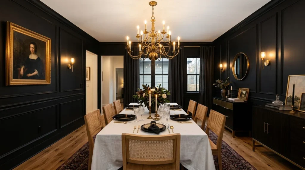
For interior applications, Tricorn Black works especially well on kitchen islands, cabinets, dining room walls, closet doors, bathrooms, and home offices. Using a matte or eggshell finish for walls and a low-sheen finish for cabinets or doors helps maintain its rich, elegant appearance.
Tricorn Black is a true black with an LRV of 3 and minimal undertones, making it a stronger and darker choice. Iron Ore has a higher LRV of 6 with green-gray undertones, creating a softer charcoal-black appearance that works well for more muted designs.
Yes, testing is recommended because dark colors can change slightly depending on natural and artificial lighting. Using movable peel-and-stick samples allows you to see how Tricorn Black looks throughout the day and alongside your existing trim, flooring, and furniture.

7 thoughts on “How to Pick a Black Paint That Actually Stays Black”